A.E.R.I
The Auditor Empowerment Research Initiative or A.E.R.I. was the code-name designated to the semester group project for a Media Convergence class I attended while pursuing a Digital Media degree at the University of Central Florida. Our group was paired with the School of Business and we were tasked with developing an instructional tool to be used by entry-level financial auditors to gain skills and a sense of experience interacting with financial clients. We were asked to mix multiple forms of media as a constraint to the assignment.
CONCEPT
As a group we decided to try and create a web platform where inexperienced auditors could go and practice by watching a group of interactive videos created to simulate interactions with clients. The video groups would represent certain common interactions and issues. The videos would be divided into declaration statements and responses based on user input. Through each series of videos users would navigate their way through a client interaction scenario. Hopefully this would allow them to familiarize themselves with a few typical client interactions as well as explore a typical reactions to certain responses, in a safe environment. We also chose to include a forum section where the auditors could talk about their experiences with one another.
DESIGN

The visual design went through many iterations before it was finalized. Originally I conceptualized a web page layout like a cluttered desk with an open file folder on it, containing the many pages of the website within. This first draft was graphically heavy-handed even including paper clips into the design. It was a decent design visually, but the team ultimately didn't go with it.

The final design was a more modern graphic design. Solid banner and transparent content layout. A light blue and grey color scheme was chosen to present a calm, cool exterior.
The logo also went through some refinement. The objective of the project overall was to empower financial auditors.The concept of empowerment was visualized by a person dressed in business attire standing in a power pose. The original color scheme and certain elements were changed and black and white logo was incorporated to add some dimension and variety to the otherwise uniform visual design.
BUILD
Unfortunately, like many group projects, this one was never fully completed. Only a template version with a partial video was accomplished. The UCF School of Business didn't show enough interest in this semi-functional template to justify further development.
Although the concept was never fully realized, I did receive a passing mark for the assignment. Mostly my score was based on the personal progress website I put up for the project as an online progress report available to the instructor to view my contributions to the assignment.
A PERSONAL REVIEW
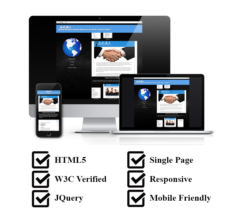
I used the same color scheme and basic banner design as in the project for my personal site. Hopefully this allowed the instructor to easily recognize which project my review site was for.

My A.E.R.I. review site was a single, responsive web page that I added design documents and other contributions to the project as I did them. These documents could be expanded or contracted by the user, displaying more or less information. This was done with a simple, custom JQuery module. This site could be viewed at any time by the instructor on their computer, tablet, or phone. This allowed them an up-to-date report of my personal contributions to the project as well as a complete overview of my work on the project during the final evaluation. I believe it is this website and the contributions documented within that allowed for my passing mark. This personal review site and it's contents can be viewed here.